• Folio
  • Store
  • About
  • Media
  • Contact
  • Subscribe

Mindy Indy

Independent Cartoonist

  • Folio
  • Store
  • About
  • Media
  • Contact
  • Subscribe

Fun & Hope

Screen Shot 2020-07-28 at 7.05.54 PM.png

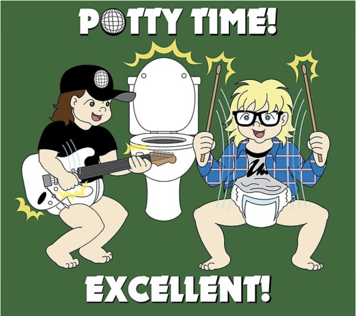
Remember Wayne’s World from classic 90s SNL?  One of my best friend’s husbands thought of this idea for a T-shirt for their toddler, and with some Mindy Indy magic, the T-shirts are alive!  You can get one on RedBubble.com

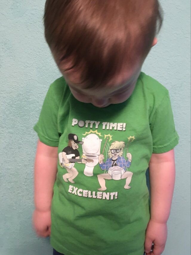
You can also get the design on a onesie or a hoodie in different colors.  Redbubble is awesome and you can print a design on anything like a sticker or a clock (potty TIME, get it?). Meanwhile – behold, the cutest model ever! (Used with permission :)

WWshirt.jpg

I started this project in late March when COVID cases were rising in NYC.  It was so great to work on something purely FUN and lighthearted during that time.  It was also fun to learn how to make patterns in Illustrator (the plaid on Garth’s shirt).  Always keep learning.

Projects like this remind me that even amidst the chaos of our world today, there is hope for creativity and new, fun ideas.  To my artist friends - even though it may seem bleak and that nobody has $, that’s just not true and there ARE people out there who value your work and WILL pay you for your skills and talents.  You just have to find them, or they need to find you, which is all about marketing, which I’m learning more about myself.

And part of that plan is that I’m revamping my mailing list.  Please reply if you’d like to keep getting Mindy Indy updates in your email!  Many thanks to all of you who have stuck with me through thick & thin over the years.  I appreciate your email support :)


tags: Wayne's World, redbubble, tshirt design, freelancing, illustration
Wednesday 07.29.20
Posted by Mindy Steffen
 

New Spiritual Mini Comic!

00cover-01.png

Hot off the press! I’ve been working on a very different kind of comic for the past few months - not really a “funny” one but it’s in the spiritual realm. It’s called “Discernment of Spirits,” and is basically about figuring out where the good and bad things in your life are coming from, and what to do about them.

I’m trying to think of how to best write about this… my audience is all over the board, and I know that some people may not be into spirituality, but when I release a new comic, I want to let everyone know!

Hopefully I’ll have some copies shipped to me in time for MoCCA Fest (if it still goes on as scheduled - who knows with the corona virus! I’ll definitely keep you posted.)

tags: spiritual, catholic, comic, illustration
Tuesday 03.10.20
Posted by Mindy Steffen
 

C4: Clear Communication with Clients is Crucial!

I'd like to take you on a walk through my illustration process for client work.   Here's a piece I recently finished that a past client requested as a Christmas gift to his wife. As freelance artists, most of the time we work with non-artists, and it's important to understand what the client is aiming for even if they can't articulate it exactly.  I'm not psychic, I mean establishing an open Q&A with the client about various details and issues that appear before and during the project.  Miscommunication with these details can lead to the client not getting exactly what they want, and an artwork that's not as strong.  But if you practice C4 (Clear Communication with Clients is Crucial), the end result is that both parties are happy:  the client gets an amazing product that exceeds their expectations, and you get a folio piece you can be proud of!

A past client emailed me to commission "a portrait-ish type piece" of his wife's dog Oliver and sent this picture.

He also said he'd like it to be "a little cartoony, but not super cartoony."  What exactly did this mean?  I sent him some examples of past dog illustrations I made and he liked the style, color, and tone of this one best.

The client described that Oliver "is basically a living cartoon character," but I thought that didn't reflect well in the original photo he sent.  The photo is almost in a profile view and reminded me of more serious hunting dog paintings of yore.  So I asked him to send me more photos where Oliver is showing his quirky personality.  I wanted to portray his more playful side, like how the black dog is romping around with the girl in the example illustration.

The client also wanted to include a "label" below Oliver of his nickname.  To clarify, I asked him if he meant something like this banner in a portrait of my parents, which was exactly what he wanted!  I told him it would be cute if the banner would be at the bottom with the dog's paws hanging over it.

Note that ALL of this communication was over various emails the happened BEFORE I even made the contract or did a sketch.  I have a rule of always finding out as much of what the client wants as possible, writing all those details in a contract we both sign, and getting a down payment of half the cost BEFORE even putting pencil to paper.  This saves TONS of time and effort down the road, and I hardly ever have to do corrections beyond minor initial sketch tweaks.  After we hashed out price, contract, and payment, I began this sketch!

In my contracts I always say that changes to the art are free in the sketching stage.  Here, the client said that Oliver's chest was stockier - he had wider shoulders and short little legs.  I realized I used the puppy picture (bottom right in the reference pics) as a main body reference.  I then used the middle picture to create the modification.

Once the sketch was approved, and since I did the sketch at actual size (14x17), I used some transfer paper to easily trace the sketch onto the hot-press watercolor board.  I added more fur details and used a compass to make the banner and letters more aligned.

Inktober really helped me - I can see an improvement in my own line weight!  I used Winsor & Newton waterproof ink here, so I can overlay the watercolors right on top later.

Since the client's wife is a huge University of Kentucky basketball fan, the client pointed out that Oliver's collar should be royal blue.  I suggested that the banner should also be blue to match, but the client had pictured the banner being gold or bronze.  Even though we think of these colors as representing high value, I knew gold or bronze would not be a good color choice here for 2 reasons:  1 - not enough contrast between the dog's fur color and those earth colors.  2 - watercolors don't shine like real metals do, and the result might be muddy.  But instead of writing all that out trying to explain myself, I made a quick digital mock-up* to SHOW the client that blue would look the best.  The client could instantly see the difference and agreed with my blue choice. 


*It's important to communicate to the client that this is just a mock-up and the final medium will look more detailed.  Here, the digital colors are solid, but the watercolors will have more varied shadows and depth.

Watercolors - the final step!  The client said the fur in the digital mock-up was a bit too dark (I based that off a shadow in the "smiling" picture).  Oliver was a different color in every reference photo due to various lighting and environments - what was his TRUE color?  I asked if the pic where Oliver is looking up is closer, and the client affirmed, adding that his chest and belly area is a little lighter than his back, sides and shoulders.  Also, his muzzle is grey because he's an older dog. 

With all that in mind, I had a heck of a time mixing the perfect light cream color (it kept turning out too peachy... must've been too much red in that Raw Sienna).  Once I got a good mix, I had to find the right balance between shadows for contrast, while still maintaining the overall light color.  I found that painting Pro White as highlights over the cream tone accomplished that goal.

Here's a clip from the client's review:  "I am not well versed in art at all and I was only able to describe to [Mindy] what I wanted at a basic level. She worked with me to develop the concept I'd described to her, was receptive to my input as the concept evolved, and ultimately delivered exactly what I wanted. The most amazing thing is she delivered my vision that I didn't even know how to describe when we started."

Another satisfied customer!  To artists, remember C4 (Clear Communication with Clients is Crucial).  It's OK to tell the client your thoughts on a better solution.  They'll respect and appreciate your expertise as an artist.  Don't be afraid to offer different ideas from what the client initially suggests.  To people looking to commission art, it's always best to trust the artist's judgment.  By working together with clear communication at all stages of the artwork, both artist and client will be happy! 

I grew up with dogs, and I know one day in the future I'll own one again.  But at this point in my life I need to save up for a new computer instead of saving up for a dog.  Every day dog care like food may not be too expensive, but God forbid if your pet gets sick.  If you don't have enough saved up it can be really draining. 

tags: C4: Clear Communication with Clients is Crucial!, mindy indy, working with clients, water color, watercolor, mock-ups, illustration, dog portrait, dog illustration, client communication, artist contracts, The Daily Misfortune
Friday 12.16.16
Posted by Mindy Steffen
Comments: 2
 

AER HEAD promo!

In preparation for this year's New York Comic Con, I've made some mini comic previews of AER HEAD!  This is the first time AER HEAD has been in print, so I'm super excited!  The mini comic includes a cover, the first 5 pages of AER HEAD, and 2 promo pages at the end for the comic itself and mindy indy as an artist.  I printed them at a local printer, and the cost came to about $1 per mini comic, which is a great price.  I'll only give these out to a few key people at comic con, whereas I'll give my business cards away like candy because those are super cheap to print in bulk if you know where to look.

Creating this promo page was a snap, due to my years of experience as a graphic designer.  Yes, I will make AER HEAD #1 in 2012, ideally before the big San Diego Comic Con in the summer, but aiming for as soon as possible.  I have a facebook page, if you haven't seen that already.  And I'm going to start using twitter more.  I haven't really used it, because it seemed annoying, and I don't want people stalking me, but I need to use it for professional purposes now.  The name mindyindy was already taken on twitter, so I had to go with mindy_indy.  Hopefully that won't confuse people.  Check mindy_indy for frequent updates when I'm at the NYCC!  I don't have a booth, because I don't have products to sell, but I'll just be walking around everywhere going to various panels about the business of publishing and such.

The back cover promotes mindy indy (aka Mindy Steffen, that's me) as an artist.  Since I do coloring work for Marvel, I feel like I have a leg up this year at the comic con, and hopefully that can lead to more coloring work.  I don't want to limit myself to just that, though, so I put pretty much everything I can do related to comics and illustration.

Just had an idea... Would anyone be interested in buying an AER HEAD mini comic?  If so, I can print more.  You can write a post or send me an email and we can work it out :)  Excitement!!

tags: AER HEAD, business, coloring, comic, facebook, graphic designer, illustration, Marvel, mindy indy, Mindy Steffen, mini comic, New York Comic Con, print, promo, twitter
categories: Uncategorized
Friday 10.07.11
Posted by Mindy Steffen
 

Powered by Squarespace.