• Folio
  • Store
  • About
  • Media
  • Contact
  • Subscribe

Mindy Indy

Independent Cartoonist

  • Folio
  • Store
  • About
  • Media
  • Contact
  • Subscribe

C4: Clear Communication with Clients is Crucial!

I'd like to take you on a walk through my illustration process for client work.   Here's a piece I recently finished that a past client requested as a Christmas gift to his wife. As freelance artists, most of the time we work with non-artists, and it's important to understand what the client is aiming for even if they can't articulate it exactly.  I'm not psychic, I mean establishing an open Q&A with the client about various details and issues that appear before and during the project.  Miscommunication with these details can lead to the client not getting exactly what they want, and an artwork that's not as strong.  But if you practice C4 (Clear Communication with Clients is Crucial), the end result is that both parties are happy:  the client gets an amazing product that exceeds their expectations, and you get a folio piece you can be proud of!

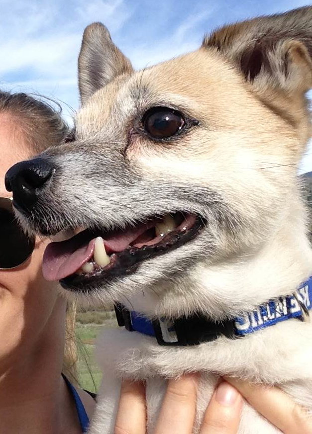
A past client emailed me to commission "a portrait-ish type piece" of his wife's dog Oliver and sent this picture.

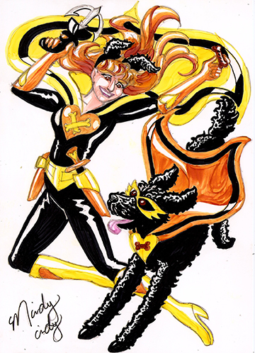
He also said he'd like it to be "a little cartoony, but not super cartoony."  What exactly did this mean?  I sent him some examples of past dog illustrations I made and he liked the style, color, and tone of this one best.

The client described that Oliver "is basically a living cartoon character," but I thought that didn't reflect well in the original photo he sent.  The photo is almost in a profile view and reminded me of more serious hunting dog paintings of yore.  So I asked him to send me more photos where Oliver is showing his quirky personality.  I wanted to portray his more playful side, like how the black dog is romping around with the girl in the example illustration.

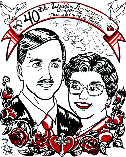
The client also wanted to include a "label" below Oliver of his nickname.  To clarify, I asked him if he meant something like this banner in a portrait of my parents, which was exactly what he wanted!  I told him it would be cute if the banner would be at the bottom with the dog's paws hanging over it.

Note that ALL of this communication was over various emails the happened BEFORE I even made the contract or did a sketch.  I have a rule of always finding out as much of what the client wants as possible, writing all those details in a contract we both sign, and getting a down payment of half the cost BEFORE even putting pencil to paper.  This saves TONS of time and effort down the road, and I hardly ever have to do corrections beyond minor initial sketch tweaks.  After we hashed out price, contract, and payment, I began this sketch!

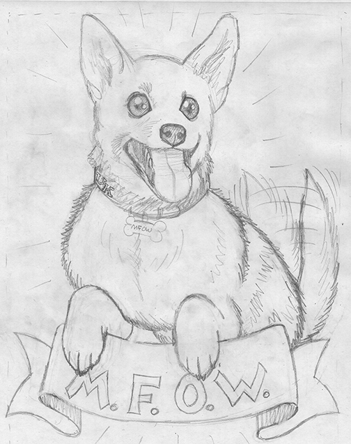
In my contracts I always say that changes to the art are free in the sketching stage.  Here, the client said that Oliver's chest was stockier - he had wider shoulders and short little legs.  I realized I used the puppy picture (bottom right in the reference pics) as a main body reference.  I then used the middle picture to create the modification.

Once the sketch was approved, and since I did the sketch at actual size (14x17), I used some transfer paper to easily trace the sketch onto the hot-press watercolor board.  I added more fur details and used a compass to make the banner and letters more aligned.

Inktober really helped me - I can see an improvement in my own line weight!  I used Winsor & Newton waterproof ink here, so I can overlay the watercolors right on top later.

Since the client's wife is a huge University of Kentucky basketball fan, the client pointed out that Oliver's collar should be royal blue.  I suggested that the banner should also be blue to match, but the client had pictured the banner being gold or bronze.  Even though we think of these colors as representing high value, I knew gold or bronze would not be a good color choice here for 2 reasons:  1 - not enough contrast between the dog's fur color and those earth colors.  2 - watercolors don't shine like real metals do, and the result might be muddy.  But instead of writing all that out trying to explain myself, I made a quick digital mock-up* to SHOW the client that blue would look the best.  The client could instantly see the difference and agreed with my blue choice. 


*It's important to communicate to the client that this is just a mock-up and the final medium will look more detailed.  Here, the digital colors are solid, but the watercolors will have more varied shadows and depth.

Watercolors - the final step!  The client said the fur in the digital mock-up was a bit too dark (I based that off a shadow in the "smiling" picture).  Oliver was a different color in every reference photo due to various lighting and environments - what was his TRUE color?  I asked if the pic where Oliver is looking up is closer, and the client affirmed, adding that his chest and belly area is a little lighter than his back, sides and shoulders.  Also, his muzzle is grey because he's an older dog. 

With all that in mind, I had a heck of a time mixing the perfect light cream color (it kept turning out too peachy... must've been too much red in that Raw Sienna).  Once I got a good mix, I had to find the right balance between shadows for contrast, while still maintaining the overall light color.  I found that painting Pro White as highlights over the cream tone accomplished that goal.

Here's a clip from the client's review:  "I am not well versed in art at all and I was only able to describe to [Mindy] what I wanted at a basic level. She worked with me to develop the concept I'd described to her, was receptive to my input as the concept evolved, and ultimately delivered exactly what I wanted. The most amazing thing is she delivered my vision that I didn't even know how to describe when we started."

Another satisfied customer!  To artists, remember C4 (Clear Communication with Clients is Crucial).  It's OK to tell the client your thoughts on a better solution.  They'll respect and appreciate your expertise as an artist.  Don't be afraid to offer different ideas from what the client initially suggests.  To people looking to commission art, it's always best to trust the artist's judgment.  By working together with clear communication at all stages of the artwork, both artist and client will be happy! 

I grew up with dogs, and I know one day in the future I'll own one again.  But at this point in my life I need to save up for a new computer instead of saving up for a dog.  Every day dog care like food may not be too expensive, but God forbid if your pet gets sick.  If you don't have enough saved up it can be really draining. 

tags: C4: Clear Communication with Clients is Crucial!, mindy indy, working with clients, water color, watercolor, mock-ups, illustration, dog portrait, dog illustration, client communication, artist contracts, The Daily Misfortune
Friday 12.16.16
Posted by Mindy Steffen
Comments: 2
 

This is where the magic happens!

This week I give you a peek into the world of the mindy indy studio! A picture of my studio when I first started storyboarding the AER HEAD comic.

This is actually the other half of my bedroom.  I live 45 minutes away from the city in Brooklyn, so it's a fairly large room!  I salvaged that big table from my roomies (who were going to throw it out!) and it's perfect for spreading out all my supplies and having lots of room to work.  Tip to other artists:  SALVAGE!  Salvage EVERYTHING!  This past weekend I even salvaged a mini grill from someone in my apt complex = the ultimate delicious victory!  But I'm on a tangent...

I also got that tall standing lamp from my roomies - it's important for me to have lots of light to work under.  Um, almost everything in my room came from my roomies because they are awesome :)  Oh except the laptop - that's mine.  It's more than 4 years old and crashes regularly :\

All those little cards on the wall are my storyboards for the AER HEAD comic.  I'm going to do a whole post just about the storyboarding process, because there's TONS to say about it!  In the first picture, they were just words on index cards, but watch as they grow on my wall:

A picture of my studio getting messier with more storyboards on the wall.

The storyboards have spread to my other wall!

The storyboards have grown and have taken over my other wall!  Luckily I have lots of wall space, but I'm running out.  The full pages are drawn with pencil so that's why they don't show up as well, but that's ok - I wouldn't want to give away the story!

Of special note is the hanging teal colored thing on my closet - it's actually a travel make-up bag that I use to put all my art supplies in!  It organizes things SO effectively and I can SEE everything that's there instead of supplies being hidden in desk drawers.  Come to think of it, I can't imagine anyone needing THAT much make-up for TRAVEL... I don't even OWN enough make-up to fill one pocket!  Getting off that tangent, besides needing a new computer, I also need a new T-square because that one isn't square anymore!  I think it must have gotten warped somehow.

Current state of my studio.

This is pretty much what my studio looks like now.  I was working on page 2 when I took this pic.  Here I have my watercolor supplies out.  It's important for me to clear my desk of most things before I begin working on a comic page because I don't work well with lots of clutter on my desk.  In particular, I clean between the inking and watercoloring stages of my comic, because both processes have tons of supplies and to have ALL of them on my desk at once is a disaster!

In retrospect, I'll take some pics with ME working in them in the future.

I've been creating page 3 this past week and will post that next week, and beyond that I'll explain more about those crazy storyboards all over my walls!  Lots to look forward to!

tags: AER HEAD, comic, mindy indy, Mindy Steffen, process, storyboarding, storyboards, studio, supplies, water color
categories: Uncategorized
Wednesday 10.27.10
Posted by Mindy Steffen
 

Page 2!

Aeryan is seen through a crystal ball held by a mysterious black cloaked figure. Sparkly rainbow outer space! I surprised myself with how well this page turned out :)  Masking fluid and white out are awesome.  Sparkly rainbow outer spaaaace!

Special thanks to my friends at Drawbridge - I inked this page at their studio.  I put their blog in my blogroll to the right.  I also learned something very interesting when I was there about "dot gain."  Take a look at the black and white line art of page 2:

This is the black and white inked version of page 2 before I colored it.

Look at the black strips coming from the character's right arm - they are separated by very thin white lines.  I learned that the lines may disappear in the printing process due to dot gain!  Dot gain is when ink spreads out a little when it's laid down on paper.  The fact that the art is shrunken down for printing would also diminish the lines' visibility.  So, in Photoshop, I widened the lines, as you can see in the final piece.  The more you know!

PS:  For some reason the email notifications for my mailing list seem to come a day late - I'll look into that!

tags: AER HEAD, black and white, comic, dot gain, Drawbridge, line art, mindy indy, Mindy Steffen, outer space, photoshop, water color
categories: Uncategorized
Thursday 10.21.10
Posted by Mindy Steffen
 

The Process (Don't try this at home)

Two versions of page 1 side by side. There are at least 7 main differences between the two. Here's a little about the process of how I did the first page, and I'll answer last week's question at the same time!

1.  The left page is colored by computer, whereas the right one is water color.

Now, backing up a bit, why did I color this twice?  Backing up even further, I usually draw directly on the comic board, but I was inspired by some people in my class who used transfer paper to save their drawings (instead of inking over them).  I've been told by various people that my drawings are better than my inking skills, so I wanted to save it.  First, I drew the page on newsprint, as shown here:

Drawing of AER HEAD page 1 on newsprint.

Then, I traced it on transfer paper to transfer it to the comic board:

AER HEAD Page 1 traced on non-photo blue transfer paper, in reverse.

It kind of looked like a blue print!  Then I inked it on the board:

Black and white inked version of AER HEAD page 1.

But then I realized if I wanted to use water colors, I had done the page on the wrong paper.  EPIC FAIL.  I didn't think ahead to the coloring process.  I really wanted to use water color because it was a strong aspect of my previous comics, but it would buckle the current paper and pieces may start to rub off.  So I tried coloring on the computer:

AER HEAD page 1 colored in Photoshop. Yellow sky, blue-green water, orange buildings.

And this looked fine.... but it just didn't feel RIGHT.  And it looked like coloring I'd seen in other comics before.  So I took the original drawing and REtraced it onto better paper (vellum bristol), RE-inked it, and finally water colored it, ending up with this:

The first page of mindy indy's new comic, AER HEAD. Watercolors of a yellow sky, sea green ocean, orange buildings of the futuristic city of New San Diego. Zooms in on a boy sleeping.

All in all, I do NOT recommend the transferring process.  True, it's cool to keep the drawing instead of inking over it, but it's totally not worth the time and AGGRAVATION.  Although, if I hadn't drawn it on another paper, I wouldn't have been able to transfer it a second time to another board...  Anyway, the rest of my pages won't involve this ridiculously insane process - I was just trying out something new.  I hope I can save some poor soul from making the same mistake.

Another thing that I changed when transferring was:

2.  Different buildings in the foreground and mid-ground.

The story begins in the futuristic city of New San Diego.  But in my first draft, the buildings didn't look... San Diego-y enough, even for it's future.  My sister lives in San Diego so I've been there many times.  I tried to incorporate the Mexican influenced architecture more in version 2.  Some have also said that the city looks more like San Francisco, but there's a reason for that on page 9.

3.  Replaced "Part 1 Aeryan the Dreamer" with "A Mindy Indy Production" and my signature.

At first I tried dividing my story up into little parts of 4 or 5 pages, but the end format will be a graphic novel, so the "parts" seemed unnecessary. That, and having a title page so often seemed kind of ridiculous.

4.  I made a black outline on the title (version 2).

Not sure how noticeable these next two are to others when scaled down on the computer:

5.  I made a broken outline on the shiny parts of buildings and other things (version 2).

6.  I gave Aeryan's hair more texture lines (version 2).

7.  I added another bridge and more city on the smallest island in the background.

So those are the major changes!  There are countless smaller details too - one of my friends also noticed I had added a new sign in place of some buildings.

Stay tuned for page 2!

tags: AER HEAD, comic, drawing, mindy indy, Mindy Steffen, photoshop, process, water color
categories: Uncategorized
Tuesday 10.12.10
Posted by Mindy Steffen
 

welcome to mindy indy!

Hi!  I'm Mindy, and this is my new comic blog!  SUPER EXCITED!!!!  I'm starting a comic series called AER HEAD, which I plan to update every week on Thursdays.  Well, the posts may technically say Fridays, but it's still Thursday according to this night owl :)  I'll post my new pages, my process of completing those pages, and other fun stuff!  For now, enjoy page one! The first page of mindy indy's new comic, AER HEAD. Watercolors of a yellow sky, sea green ocean, orange buildings of the futuristic city of New San Diego. Zooms in on a boy sleeping.

STARE HEAD:  Stare at the pictures below.  Can you find at least 7 main differences between two versions of this page?

Two versions of page 1 side by side. There are at least 7 main differences between the two.

I'll have the answer for you next week!

tags: AER HEAD, comic, mindy indy, Mindy Steffen, STARE HEAD, water color
categories: Uncategorized
Thursday 10.07.10
Posted by Mindy Steffen
 

Powered by Squarespace.