• Folio
  • Store
  • About
  • Media
  • Contact
  • Subscribe

Mindy Indy

Independent Cartoonist

  • Folio
  • Store
  • About
  • Media
  • Contact
  • Subscribe

Computer Crash!!

There I was last Saturday night, working on some sketches for a client in Photoshop, when suddenly the screen went spaZoid, then black.  I remained calm.  But then I started to worry when my computer wouldn't restart!  I immediately made a Genius Bar appointment for the next day at the 24-hour Apple store (yes, we have one of those in NYC :)

Basically it was a problem with the laptop's logic board, and apparently was a defect of some early 2011 computers, because they fixed it for free!  Thank God, because it would have been like $600 otherwise, and this computer is 5 years old, so I'd probably only get another year out of it anyway. 

Luckily, I wasn't too worried about data loss because I back up via Crash Plan!!  It's basically cloud backup.  At first, when my external hard drive crashed a few years ago, the concept of backing up to some unknown location was scary to me, but it actually works out very well!  Before, with my external HD, I'd only backup at the end of the day (or every few days), but this way I backup continuously.  I had to redo some stuff on the one file I was working on at the time of the crash, but all other files I'd worked on that day were fine.  But seriously, if I didn't have the comfort of cloud backup, this situation could have been A TOTAL DISASTER.

But the Mac doctors had to take my computer away to do some operations for a few days.  I had separation anxiety, as I'm protective of my laptop to a ridiculous degree.  They said it could take 5 business days, but I insisted it had to be fixed by Thursday, as I have a weekly deadline (the No Tears: Life With FD comic!  Colored digitally in Photoshop).  Of course, there is never a good time for a crash to happen, but when an artist relies heavily on their computer to get work done for many clients, it's a tough situation!  I was very adamant about this, and the Mac doctors were very understanding.  I did have some physical drawings for a custom comic that needed to be done in the meantime though, so I was still productive.  Luckily, they fixed my Mac 2 days early!  The squeaky wheel gets the grease! 

And so far all files and programs are OK and running smoothly (knock on wood).  The Mac doctors didn't have to wipe my drive, so I didn't even need to spend the time re-uploading everything from Crash Plan and was able to jump right back into work!  Given everything that happened, with so many points at which things could take a turn for the worse, this situation turned out pretty damn good!  

tags: computer crash, technology problems, No Tears: Life With FD, photoshop, Crash Plan, apple store, mac doctors, The Daily Misfortune, mindy indy
Friday 05.27.16
Posted by Mindy Steffen
 

Thea Stilton #5 out NOW!

It's finally here!  Papercutz presents Thea Stilton #5 - The Secret of the Waterfall in the Woods!  This was what I spent a solid 2 weeks on last summer, coloring night and day.  I am SO PROUD of how beautifully this book came out!  It's so satisfying to hold a copy in my hands after all that hard work.

Thea has much more detailed shading than when I colored the Power Rangers.  You can see the different Photoshop brush textures I used in the pine needles, trunks, and rocks.  Lots of nature scenes in this book, which has an eco-friendly message.  The five Thea Sisters of Mouseford Academy solve mysteries, and this episode features saving a family of bears in the woods.  There's danger, deception, teen angst, cuteness, and more!

One of the challenges in coloring this book was the sheer number of characters - lots of crowd scenes like above, with many pages having around 30 characters each!  When you're coloring 46 pages on a tight deadline, that adds up.  Luckily, I was able to get a flatter (Matt Herms) to help with half the pages.  Delegation gets stuff done.

I'll be at the IPG booth doing signings and sketches for Papercutz at C2E2 in Chicago!  C2E2 is March 18 - 20, and I'll do a signing each morning, as well as be at my artist alley table i16a the rest of the time.  I'll do a separate C2E2 blog later.  So much going on!  But that's a good thing.

Speaking of books, this Daily Misfortune was inspired by my mom.  Yep, last month is was just her and the librarian.  A die hard mystery novel lover.

tags: Thea Stilton, Thea Sisters, The Secret of the Waterfall in the Woods, Papercutz, colorist, photoshop, The Daily Misfortune, mindy indy, Mouseford Academy, c2e2, IPG
Thursday 02.25.16
Posted by Mindy Steffen
Comments: 1
 

Black Friday

I was almost lured into a Black Friday deal for a cheap external HD (by Seagate) at Staples for like $40.  Upon further research, Seagate external HDs have a 30% failure rate, which is super scary, as compared to other companies which have like a 1% or 2% failure rate.  There's a reason why some things are on sale.

But I DID actually end up getting a good deal on my Adobe programs, which I use all the time.  Adobe is having a Black Friday 20% off sale for everyone, so you can change your membership and save.  I downgraded from the All Apps Creative Cloud to getting single apps of Photoshop CC and Illustrator CC.  I honestly have used Flash only one time for a project since getting the All option.  Luckily, they have a monthly option so I can download Flash once I have an animation project, and then cancel once the project is done in a month.  I really don't do animation "on the side" just for fun - it takes forever, and I'd rather create comics.  Even though this change was scary, I'll save $20/month, which is $240 per year!  Changing anything technical that involves art programs is very scary because we artists aren't usually techie-minded to fix stuff if something goes wrong.  But as long as you do your research so you're well informed, and get help from Adobe chat or calling (or whatever company, perhaps Microsoft or GoDaddy), you CAN make changes to suit your specific needs as time goes on and your needs change.  

Side note, on the phone, I accidentally called it the "Black Friday Bundle" because I'd watched that South Park episode recently.  The word "bundle" is nowhere on the Adobe site!  Thank God I didn't call it "Bunduru!"

Also, I'M having a special Black Friday/Small Business Saturday sale on all sketch orders this weekend!  Free shipping PLUS 10% off!  Offer ends Monday November 30!  Now's the perfect time to get a sketch as a present for a loved one for the holidays!

tags: Black Friday, Adobe, photoshop, adobe illustrator, creative cloud, flash, The Daily Misfortune, mindy indy, brack friday bunduru
Friday 11.27.15
Posted by Mindy Steffen
 

Adventures With Intuos!

Purple Striped Jellyfish!

Purple Striped Jellyfish!

I've been having so much fun with my new Intuos Wacom tablet!  Here's the very first illustration I did solely in Photoshop!  (Well, I did some in high school with MS Paint... [cringes]).  This is the Purple Striped Jellyfish - I love jellyfishes!  This creature lends itself very well to the pressure sensitivity and sweeping lines that can be created using the Intuos.  Last time, I was testing inking my comic pencil work, and it was harder to make the sweeping motions when tracing a line.  But when drawing from scratch digitally, it's easier because your hand can just go where it wants to and isn't hindered by following lines. 

Sketches of Purple Striped Jellies in the Monterey Bay Aquarium

Sketches of Purple Striped Jellies in the Monterey Bay Aquarium

Just for kicks, here are some colored pencil sketches I did of some Purple Striped Jellies when I visited the Monterey Bay Aquarium years ago.  Now, this aquarium has the largest most awesome collection of jellies I've ever seen!  Like, entire rooms where you're surrounded by huge jellyfish everywhere!  I liked the Purple Striped ones because they're very colorful and flowy.  They really like swimming upside down as pictured above. 

Comparing the two kinds of illustration, it's always great to have a mini travel sketchbook to capture what's in front of you fast, especially when traveling.  But when I spent more time with the Wacom rendering of the jellyfish, I really got to capture the transparencies of it!  Yay Photoshop layers!  Watercolors by hand could also present transparencies, but with a different texture and feel.  Even though the digital rendering has a more cartoony look, the smoothness is closer to how the animal is in reality.

I'll probably always draw with a mix of good ol' pencil & paper and the wacom, but it worries me a bit if I may get too reliant on technology.  Like, I'm locked into Adobe's pay per month program, and after learning of some cheaper alternatives, I sometimes regret it.  It's an industry standard, so it's good to know Adobe programs, but the fact that they can raise the price at any time makes me worry.  I guess I could always export all my files to tiffs, but that's a LOT of files...

tags: Purple Striped Jellyfish, mindy indy, The Daily Misfortune, Adobe, photoshop, Intuos Pro, wacom, Monterey Bay Aquarium
Wednesday 01.21.15
Posted by Mindy Steffen
 

Artist UPGRADE!

Mindy Indy's new digital tools!

Mindy Indy's new digital tools!

I'm so super excited about some fancy devices that will help me in comic creation efficiency!  For a Christmas present to myself, I got a brand new Intuos Pro by Wacom, and my comic artist friend Warner gave me his old A3 scanner because he got an upgraded scanner/printer.  With these tools combined, I can conquer the world!  ART BATTLING COMMENCE!

For awhile I'd been wanting a bigger scanner to scan whole comic pages but gave up because they were too pricey.  Thus, with the free 8.5x11 scanner I found on my apartment doorstep (I'm too much of a cheapskate for my own good), I scanned large images in pieces and stitched them together in Photoshop.  What a time waster!  A few times I was able to access larger scanners for rush projects but that was lots of running around.  But now I can easily scan 11x17 sized paper in the blink of an eye!  Pictured above is the A3 Scanner, which uses Twain Driver.  Works for both Mac and PC.  Simple and easy to use because it does one thing and does it very well - scans big stuff!

I've also wanted to get a better Wacom tablet for awhile.  Seeing ads for the Surface Pro 3 (where you draw directly on the screen) made me want to get one of those at first, but upon trying it out in Best Buy, it was much smaller than I expected.  How can you create legit art on such a tiny screen?  I've seen people do it, but it's not for me.  The Best Buy techie recommended the Intuos family of tablets, and I'm pretty happy with it so far!  Previously I used a Wacom Bamboo for digital coloring, but it's the most basic one (only $25).  It worked well for solid coloring but I couldn't draw smooth lines for creating artwork SOLELY on the computer.  Also, the pressure sensitivity sucks.  And the pen nib always wore down too flat, which made my "brush" too blunt.  Anyway I've been playing around with the Intuos Pro and it's pretty awesome so far!  My goal is to create more comics solely digitally, which will be much faster!

It's serendipitous that I acquired these devices at the same time.  As shown above, I've scanned an AER HEAD page and am playing around with digital inking.  AER HEAD is drawn by hand on bristol, and is like 75% drawn, but I've had some hang-ups about changing scenes around and moving forward.  But working digitally makes it SO much easier to edit!  Yay for the UNDO command!  And inking is pretty much like tracing with pizazz anyway.  I've gotten frustrated with my traditional inking tools, like unexpected globs of ink plopping out of nowhere.  Having to switch pens each time you want to change line widths (I find the brush to be too blobby for inking small works).  Trying to draw a line and no ink will come out even when I just dipped it in ink.  The list goes on.  It'll still take awhile for me to master the Intuos and digital inking, but I think it's a step in the right direction.  Mostly experimenting in Photoshop, and tried Illustrator but have had some problems.  While Illustrator is great about smoothing the line, when I lift the pen from the tablet the line ends quite bluntly and not gradual like in Photoshop.  Any comments on digital inking are appreciated!  I've been looking at some online tutorials too.

WHOO that's a long post!  So much to blog about on this topic! 

Sometimes it's good to be thrifty, but when that thriftiness is holding you back from being productive, it's better to invest in tools that will make your life easier.  If you're just entering a field, it's good to begin by seeing how you can get by on cheaper materials that work just fine but maybe they take more time.  But once you're on the professional scope of your field, it's time to get serious and invest in some better tools.  I'm not saying buy the most expensive things, because even though business expenses are tax deductible, you only have so much $ in your account.  But growing in knowing yourself, your habits, and your field will help you to spend money more wisely in a way that will benefit you the most.


tags: Intuos Pro, Wacom tablet, wacom, digital art, digital inking, AER HEAD, A3 scanner, photoshop, illustrator, surface pro 3, Best Buy, wacom bamboo, money matters, business of art
Tuesday 01.20.15
Posted by Mindy Steffen
Comments: 4
 

Rockaway Beach Studies

Rockaway Beach Pic Rockaway Beach Scan

This weekend I went to Rockaway Beach in Queens, NY.  I heard it's a great surf beach, and wanted to sketch the waves and surfers for Aer Head references (besides just having awesome beach relaxation :)  The above sketch was done with Prismacolor markers.  I scanned it with my recycled scanner, but the colors weren't as vibrant.  I had to tweak it in Photoshop to get the bottom picture.  The top picture, just taken with my camera, is actually closer to the true colors.  So far, the scanner doesn't seem to be that great with colors (maybe that's why it was on the curb).  But for line art it's great.

Surfer Study 1Surfer Study 2

When I think of surfing, I think of gigantic waves, and was a bit disappointed when all I saw was tiny waves.  Maybe it was the wrong time of day for big waves?  I still got to capture some surfing gestures.  It was hard because surfers move fast.  I mostly sketched the surf board's size in relation to people's bodies, because I had trouble with that size ratio when drawing Aer Head.  Also, a detail I noticed was that all the surfers have a cord attaching their board to their foot.

The Daily Misfortune 44

tags: AER HEAD, mindy indy, Mindy Steffen, photoshop, Prismacolor markers, Rockaway Beach, sketch, surfing, The Misfortune Cookie
categories: AER HEAD, The Daily Misfortune
Monday 08.06.12
Posted by Mindy Steffen
 

THE MISFORTUNE COOKIE

The Misfortune Cookie Cover

The Misfortune Cookie Page 1

The Misfortune Cookie Page 2

The Misfortune Cookie Page 3

The Misfortune Cookie Page 4

The Misfortune Cookie Page 5

The Misfortune Cookie Page 6

The Misfortune Cookie Back Cover

I drew this short comic in two weeks, even while sick for the last week.  I took a lot of short cuts, like drawing on regular typing paper (vs. bigger bristol board), inking with micron pens (vs. pen nibs dipped in ink), filling in the blacks in Photoshop (vs. by hand with brushes), and adding text in Adobe Illustrator (vs. by hand).  But now this story is finally out in the world!  The last two pages are promotional to fill the extra pages for the 8 page mini comic, but it could stand alone without them.  ENJOY!!

tags: adobe illustrator, comic, mindy indy, Mindy Steffen, photoshop, The Misfortune Cookie
categories: Uncategorized
Thursday 05.17.12
Posted by Mindy Steffen
 

NYCC 2011

Words are not enough to describe how awesome and inspiring the New York Comic Con was this year!  I met SO MANY awesome people everywhere I went and learned immensely important things for my career as a cartoonist.

I got a 4 day "Professional" pass.  Usually the con is 3 days, but Thursday was open to just Professionals.  That's why you see all that clear space around me in the top picture, and craziness in the pic just above (taken Saturday).  It helped to have time to scope things out before it got insane.  I was able to talk with some other professionals I may not have gotten one-on-one time with otherwise, like Victor Gorelick: Co-President/E-I-C of Archie Comics, and Paul Kaminski: Compilation Editor of Sonic the Hedgehog.  More on Sonic later :)

Half the time I spent going to panels (meaning interviews with creators/business people, rather than drawn comic panels on a page!).  The ones I targeted were mostly about "how to" things, like self-publishing your comic, copyrighting, and digital distributing.  One of the best panels was about using Kickstarter to fund and market your comic, so that may be the way AER HEAD gets out into the world.  I even went to a panel about planning events in a comic store.  It was aimed at store owners, but was actually very helpful in teaching interesting marketing techniques.  Another useful one was about digital coloring.  Christina Strain blew my mind away with all the awesome Photoshop stuff she demonstrated.  I thought I knew a lot about coloring before, but there's so much more to learn!

I loved the panel about Womanthology, which is a compilation of short comic stories drawn and written by women.  Womanthology is being put together by Renae De Liz, who I got to meet and is super awesome!  She also drew the gorgeous artwork for the graphic novel adaptation of The Last Unicorn (one of my favorite childhood animations).  I also met her husband, Ray Dillon, who inked and colored her work.  This couple is so inspiring not only because their artwork is supernaturally amazing, but they have such drive and passion about them, as well as being very friendly down-to-earth people.  Another Last Unicorn person I saw was Peter S. Beagle, who wrote the original prose novel that the animation was based off.  I met him once before at the San Diego Comic Con years ago, and it was just as awesome seeing him again.

Another highlight was the Sonic the Hedgehog panel!  I've been a lifelong fan of Sonic - from the videogames to the tv shows to the comic.  I was thrilled to meet my favorite Sonic artist, Patrick Spaziante ("Spaz")!  I asked him lots of questions about his career, gave him one of my AER HEAD mini comics, and practically launched into outer space when he said that HE liked MY artwork!  How cool is THAT?  As Sonic would say:  "Way past cool!"  I also briefly met Ian Flynn, writer of Sonic.  Everyone working on Sonic just beams with positive energy and it shows that they really love what they do.  Someday, I want to be part of that team!

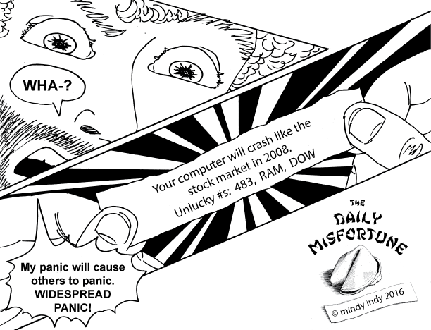
I also spent a lot of time in the "Artist's Alley" section of the Con.  This is the section where independent comic publishers and freelance artists have booths to sell their books and showcase their artwork.  The more I talked with artists there, the more I felt the calling to get a table at this and other cons too.  Some artists suggested starting with the smaller conventions to save money, so keep an eye out for mindy indy at your local Brooklyn cons soon :)  (In this context, "con" is short for convention.  I don't intend to con people :)

I noticed a significant difference in people's general responses to me this year when I mentioned that I colored Marvel comics as Kyle Baker's assistant.  (I was careful not to look like I was blatantly name-dropping, and didn't bring it up with everyone.  It naturally came up in conversations).  I had a published Deadpool Max comic to show as an example too.  Last year, I toted my portfolio around to publishers and asked advice, and was told at worst that my style wasn't what they were looking for, and at best to just submit samples online to the company's general email, not to anyone specific.  (I don't like online art submissions, because like job submissions, I think they go into a black void and my time was wasted).  But this year, people paid attention to me more!  I got lots of positive feedback from the AER HEAD mini comics, and I may have gotten some possible leads to future projects - fingers crossed!

Speaking of Deadpool, a gazillion people dressed up as him!  Everywhere I turned, there was Deadpool!  I think because there's a movie coming out soon.  I felt special that I get to contribute my talents to something so big and popular :)

While I'm at it, here are more cool costumes!  If you don't know, Comic Cons are places where people dress as their favorite characters, often going to amazing lengths over details.  I especially appreciate when I see unique characters from my childhood, like Darkwing Duck!  Look at how the guy made the duck feet - they're 3 shoes glued together!

There are so many more awesome stories to tell, but it's past 4AM.  Overall, this year's NYCC was more amazing than I could have imagined!  I met fantastic people, reconnected with some old friends, learned a whole lot about the business, and had a TON of fun all at once!


tags: AER HEAD, Archie Comics, Artist's Alley, business, Christina Strain, color, comic, copyright, DeadPool Max, freelance, Ian Flynn, Kickstarter, Kyle Baker, Marvel, mindy indy, Mindy Steffen, New York Comic Con, NYCC, panels, Patrick Spaziante, Paul Kaminski, Peter S- Beagle, photoshop, professional, publishers, Ray Dillon, Renae De Liz, self-publishing, sonic, Sonic the Hedgehog, Spaz, The Last Unicorn, Victor Gorelick, Womanthology
categories: Uncategorized
Monday 10.17.11
Posted by Mindy Steffen
 

DeadPool Max

Some of you have been telling me "I want more AER HEAD!"  I know - I do too!  My freelancing has been picking up lately, which is great news for me, but it also means that AER HEAD takes a back seat for a bit.  When I was making a page every other week back in the fall, I was also unemployed :/  I wish I could work on AER HEAD full time and somehow get paid for it, but in the meantime, I'll keep trying to find a good balance between work projects and personal projects.  But I'm excited to say that I'm getting comic and animation work: The cover of DeadPool Max #1

Recently, I became a colorist for Marvel!  I'm an assistant to Kyle Baker, who draws some of Marvel's comics.  I just colored DeadPool Max #8, which should be out next month.  (#1 is shown above.  All DeadPool Max characters © Marvel 2011)  It's so crazy - I never thought I'd be working for Marvel because our styles are so different.  But I can color in any style!  Kyle draws in Photoshop and sends me the files, and I do the "flats," which are the solid colors.  Then I do some shading, send it to him, and he touches it up with his personal flair.  You can see an example of a panel I colored here.

I've also gotten an animation gig, animating the end credits for Heart of a Doll, the film I was an art assistant for (see last post).  One thing leads to another :)  I'm so glad things are finally starting to come together for my career, after a year of being in NYC.  What will the future hold?  Only Aeryan knows ;)

tags: AER HEAD, animation, colorist, comic, DeadPool Max, freelance, Heart of a Doll, Kyle Baker, Marvel, mindy indy, Mindy Steffen, photoshop
categories: Uncategorized
Wednesday 04.13.11
Posted by Mindy Steffen
 

How Great Thou Art

mindy indy is standing next to 4 pieces of her original AER HEAD comic art. I was in an art show this past Saturday called "How Great Thou Art" at Old St. Patrick's.  It was super fun!  I loved meeting everyone and talking with people about my art and their art.  It was a great way to get my artwork out to some people who may not have seen it otherwise.

People looking at mindy indy's AER HEAD comic art on the wall.

I practically got a whole wall to myself, and I displayed the originals of the surfing promo illustration and the first 3 pages of AER HEAD, along with print outs of the final pages below them.  This was especially important for page 3, where I edited the sound effects in Photoshop.  If you just look at the original without context, it doesn't really make sense for Aeryan to get jolted out of bed in reaction to... nothing.  I hand drew the words in the margin of the original instead of typing them.  I could do a whole post about why I prefer hand lettering over computer lettering, but that's for another time :)  Also, here's a strange but true fact:  the sea green wall color was practically the same color I used for the water in all my pieces!  Yay for coincidental color coordination!

These next 2 photos are courtesy of George Goss, who had a large vivid photography piece in the show.  The guy in the fedora I'm talking with, Mike Lahey, sung and played guitar very soulfully.  There were many other great performances throughout the night including opera singing, a rock band, and poetry reading.

mindy indy poses like a diva in front of a chalkboard full of artsy writing.

George was also taking pics of lots of people in front of this chalkboard that had artsy writing all over it.  I think people wrote about whatever art meant to them.  All I know is that I was called there and then posed like a diva.

So I want to be in more art shows now :)  I never really thought the gallery would be my scene, but I'm loving it!  If you know of an art show or gallery that fits my work, I'd love to hear about it.

In the meantime, I'm drawing page 4 - what's Aeryan's dream like?  Find out next week!

tags: AER HEAD, art show, comic, gallery, George Goss, hand lettering, how great thou art, Mike Lahey, mindy indy, Mindy Steffen, Old St- Patrick's, photoshop
categories: Uncategorized
Thursday 11.18.10
Posted by Mindy Steffen
 

Page 2!

Aeryan is seen through a crystal ball held by a mysterious black cloaked figure. Sparkly rainbow outer space! I surprised myself with how well this page turned out :)  Masking fluid and white out are awesome.  Sparkly rainbow outer spaaaace!

Special thanks to my friends at Drawbridge - I inked this page at their studio.  I put their blog in my blogroll to the right.  I also learned something very interesting when I was there about "dot gain."  Take a look at the black and white line art of page 2:

This is the black and white inked version of page 2 before I colored it.

Look at the black strips coming from the character's right arm - they are separated by very thin white lines.  I learned that the lines may disappear in the printing process due to dot gain!  Dot gain is when ink spreads out a little when it's laid down on paper.  The fact that the art is shrunken down for printing would also diminish the lines' visibility.  So, in Photoshop, I widened the lines, as you can see in the final piece.  The more you know!

PS:  For some reason the email notifications for my mailing list seem to come a day late - I'll look into that!

tags: AER HEAD, black and white, comic, dot gain, Drawbridge, line art, mindy indy, Mindy Steffen, outer space, photoshop, water color
categories: Uncategorized
Thursday 10.21.10
Posted by Mindy Steffen
 

The Process (Don't try this at home)

Two versions of page 1 side by side. There are at least 7 main differences between the two. Here's a little about the process of how I did the first page, and I'll answer last week's question at the same time!

1.  The left page is colored by computer, whereas the right one is water color.

Now, backing up a bit, why did I color this twice?  Backing up even further, I usually draw directly on the comic board, but I was inspired by some people in my class who used transfer paper to save their drawings (instead of inking over them).  I've been told by various people that my drawings are better than my inking skills, so I wanted to save it.  First, I drew the page on newsprint, as shown here:

Drawing of AER HEAD page 1 on newsprint.

Then, I traced it on transfer paper to transfer it to the comic board:

AER HEAD Page 1 traced on non-photo blue transfer paper, in reverse.

It kind of looked like a blue print!  Then I inked it on the board:

Black and white inked version of AER HEAD page 1.

But then I realized if I wanted to use water colors, I had done the page on the wrong paper.  EPIC FAIL.  I didn't think ahead to the coloring process.  I really wanted to use water color because it was a strong aspect of my previous comics, but it would buckle the current paper and pieces may start to rub off.  So I tried coloring on the computer:

AER HEAD page 1 colored in Photoshop. Yellow sky, blue-green water, orange buildings.

And this looked fine.... but it just didn't feel RIGHT.  And it looked like coloring I'd seen in other comics before.  So I took the original drawing and REtraced it onto better paper (vellum bristol), RE-inked it, and finally water colored it, ending up with this:

The first page of mindy indy's new comic, AER HEAD. Watercolors of a yellow sky, sea green ocean, orange buildings of the futuristic city of New San Diego. Zooms in on a boy sleeping.

All in all, I do NOT recommend the transferring process.  True, it's cool to keep the drawing instead of inking over it, but it's totally not worth the time and AGGRAVATION.  Although, if I hadn't drawn it on another paper, I wouldn't have been able to transfer it a second time to another board...  Anyway, the rest of my pages won't involve this ridiculously insane process - I was just trying out something new.  I hope I can save some poor soul from making the same mistake.

Another thing that I changed when transferring was:

2.  Different buildings in the foreground and mid-ground.

The story begins in the futuristic city of New San Diego.  But in my first draft, the buildings didn't look... San Diego-y enough, even for it's future.  My sister lives in San Diego so I've been there many times.  I tried to incorporate the Mexican influenced architecture more in version 2.  Some have also said that the city looks more like San Francisco, but there's a reason for that on page 9.

3.  Replaced "Part 1 Aeryan the Dreamer" with "A Mindy Indy Production" and my signature.

At first I tried dividing my story up into little parts of 4 or 5 pages, but the end format will be a graphic novel, so the "parts" seemed unnecessary. That, and having a title page so often seemed kind of ridiculous.

4.  I made a black outline on the title (version 2).

Not sure how noticeable these next two are to others when scaled down on the computer:

5.  I made a broken outline on the shiny parts of buildings and other things (version 2).

6.  I gave Aeryan's hair more texture lines (version 2).

7.  I added another bridge and more city on the smallest island in the background.

So those are the major changes!  There are countless smaller details too - one of my friends also noticed I had added a new sign in place of some buildings.

Stay tuned for page 2!

tags: AER HEAD, comic, drawing, mindy indy, Mindy Steffen, photoshop, process, water color
categories: Uncategorized
Tuesday 10.12.10
Posted by Mindy Steffen
 

Powered by Squarespace.